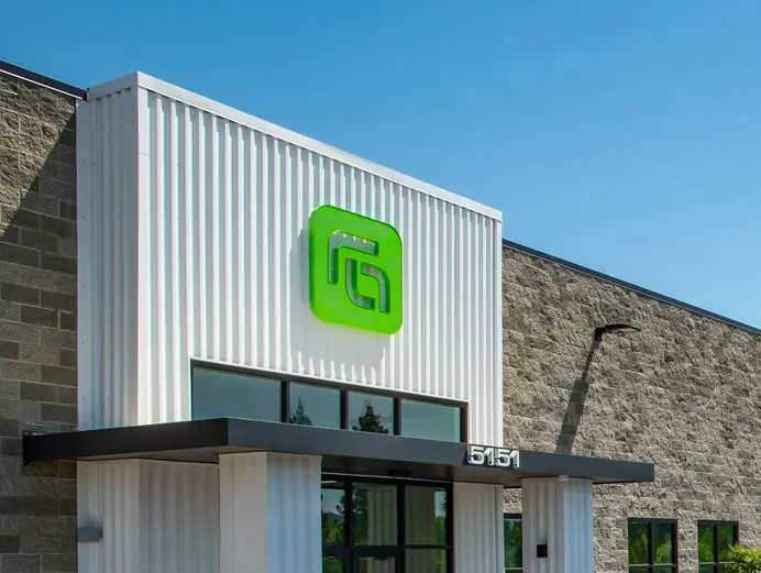
The objective was to create a modern, impactful visual identity that communicates strength, structure, and the foundational principles of building and construction.

Strategy
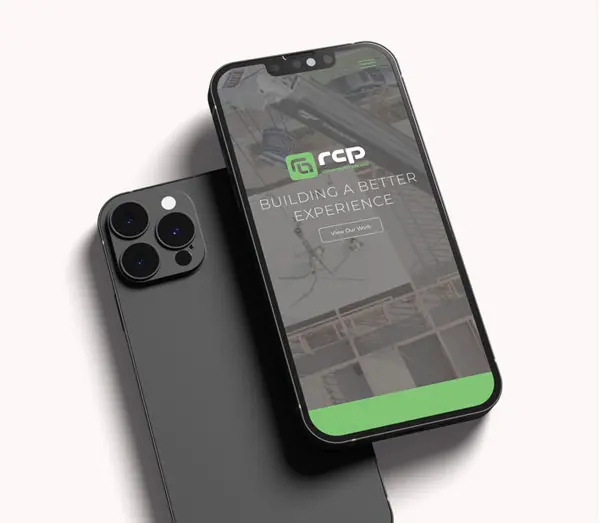
Crux designed a distinctive logo icon that cleverly integrates the letters R, C, and P into a single, unified mark. The letterforms are constructed from solid, geometric shapes that overlap and interlock, symbolizing strength, structure, and a solid foundation. The forms are reversed out of a bold block shape, reinforcing the idea of stability and precision in construction.
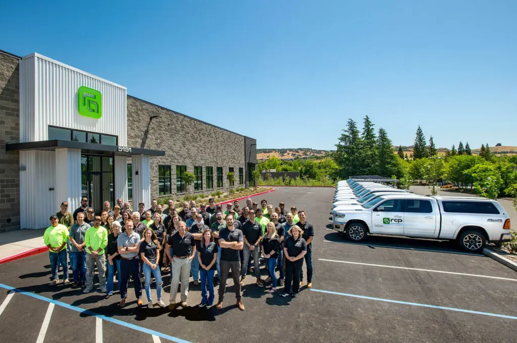
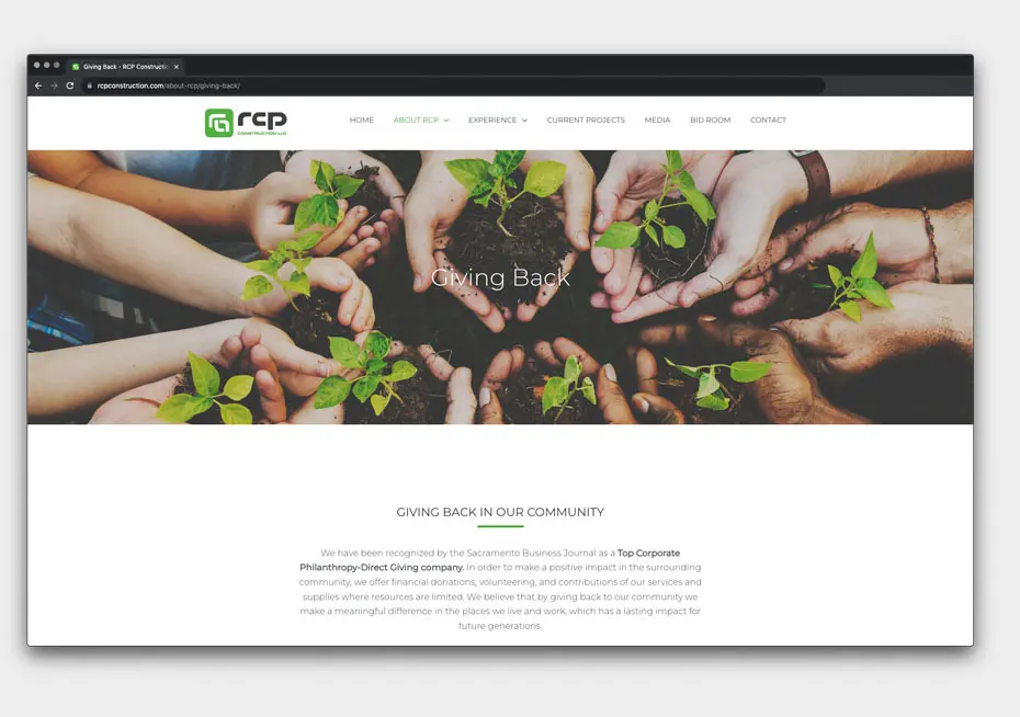
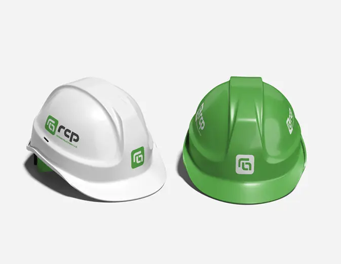
In addition to the core brand mark, Crux designed and developed a custom website and business cards, ensuring a cohesive visual presence across both digital and print platforms. The project also included brand guidelines outlining proper logo usage across various applications, including apparel, promotional merchandise, signage, and other branded materials—ensuring consistency and long-term brand integrity.
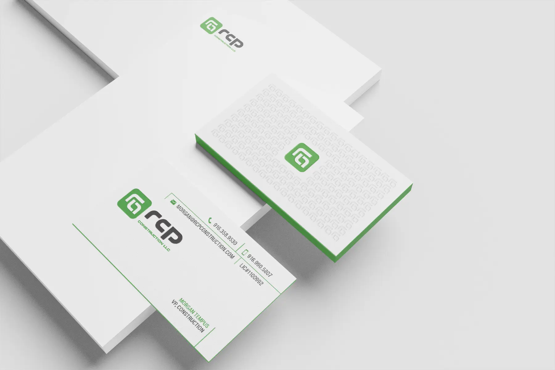
The typography has been carefully crafted to complement the icon’s geometric style, featuring clean lines and balanced proportions that align seamlessly with the overall visual identity. Together, the icon and wordmark create a cohesive and powerful brand presence that reflects RCP Construction LLC’s commitment to quality and structural integrity.
Crux provides ongoing guidance across all digital and print initiatives to ensure the brand is applied consistently and effectively. Serving as a dedicated brand steward, Crux helps maintain the integrity and impact of the logo and overall visual identity at every touchpoint.